


Kaya Dawkins Photography
A calm, confident online home for a London portrait and branding photographer — designed to feel exactly the way her shoots do.
Client
Kaya Dawkins
Package
The Standout Website
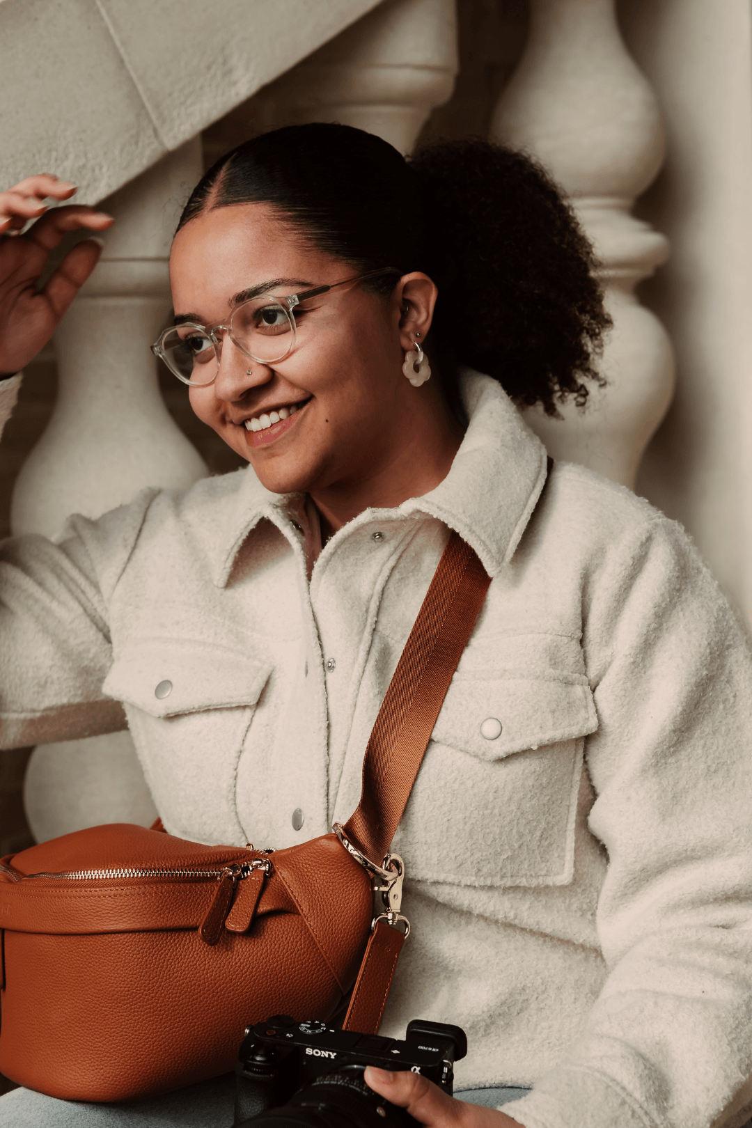
Kaya Dawkins is a London-based portrait and personal branding photographer who helps creatives, founders, and individuals feel seen, confident, and proud of how they show up online. Her work is rooted in authenticity — natural light, genuine expression, storytelling and no forced posing. She's the kind of photographer who notices the small details everyone else misses, and that's what makes her work so special.
Kaya came to me through The Standout Website package, looking for a custom Squarespace website with a brand glow up and full copywriting – a digital home that would finally match the quality of the experience she delivers behind the camera.
The “Before”
Kaya’s photography is stunning, and her client experience is genuinely thoughtful.
But her website wasn't telling that story.
When I reviewed her existing site, the gaps were clear.
There was little to no copy, and no Services page — just a brief About Me section and some portfolio images doing all the heavy lifting on their own.
The brand voice hadn't been defined, so nothing on the site communicated how Kaya works, why her approach is different, or what clients can actually expect when they book with her.
The visual identity lacked cohesion across platforms, and the site didn't guide visitors through a clear journey from "oh, her work is beautiful" to "I need to book this woman immediately."
Kaya knew exactly what she wanted people to feel – calm, excited, confident – but the website wasn't creating that experience. She also told me something I often hear from talented creatives: she didn't feel her site differentiated her from other photographers. That's a real problem.
The website needed to do more than look pretty. It needed to work.
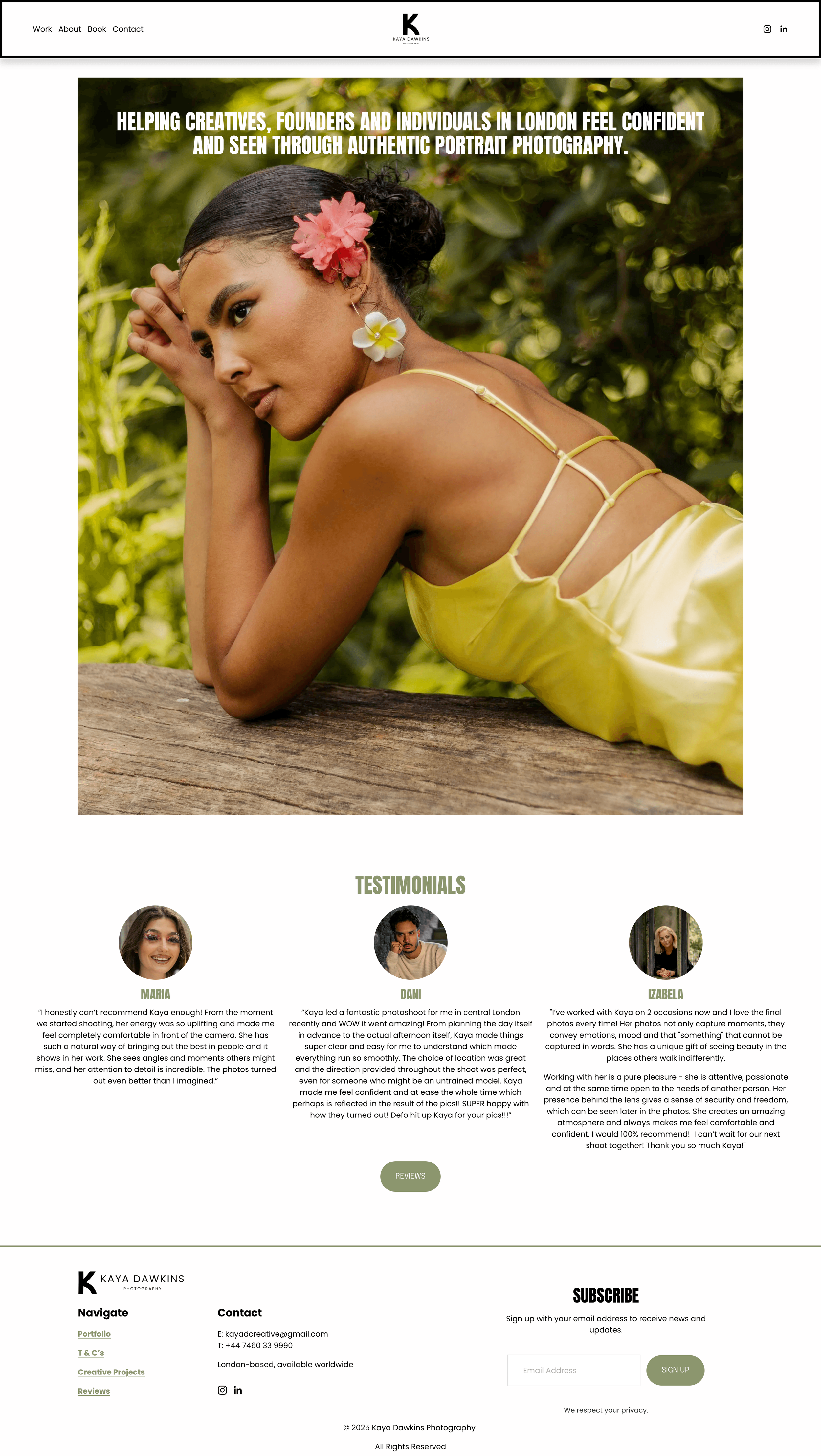
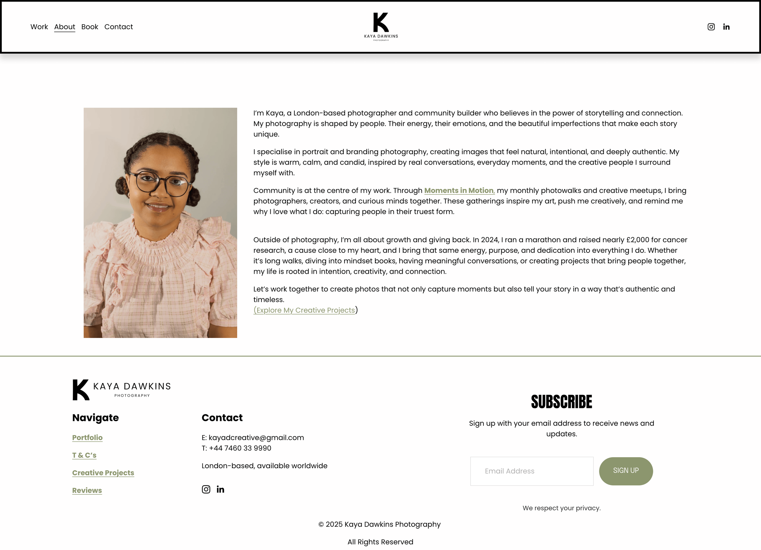
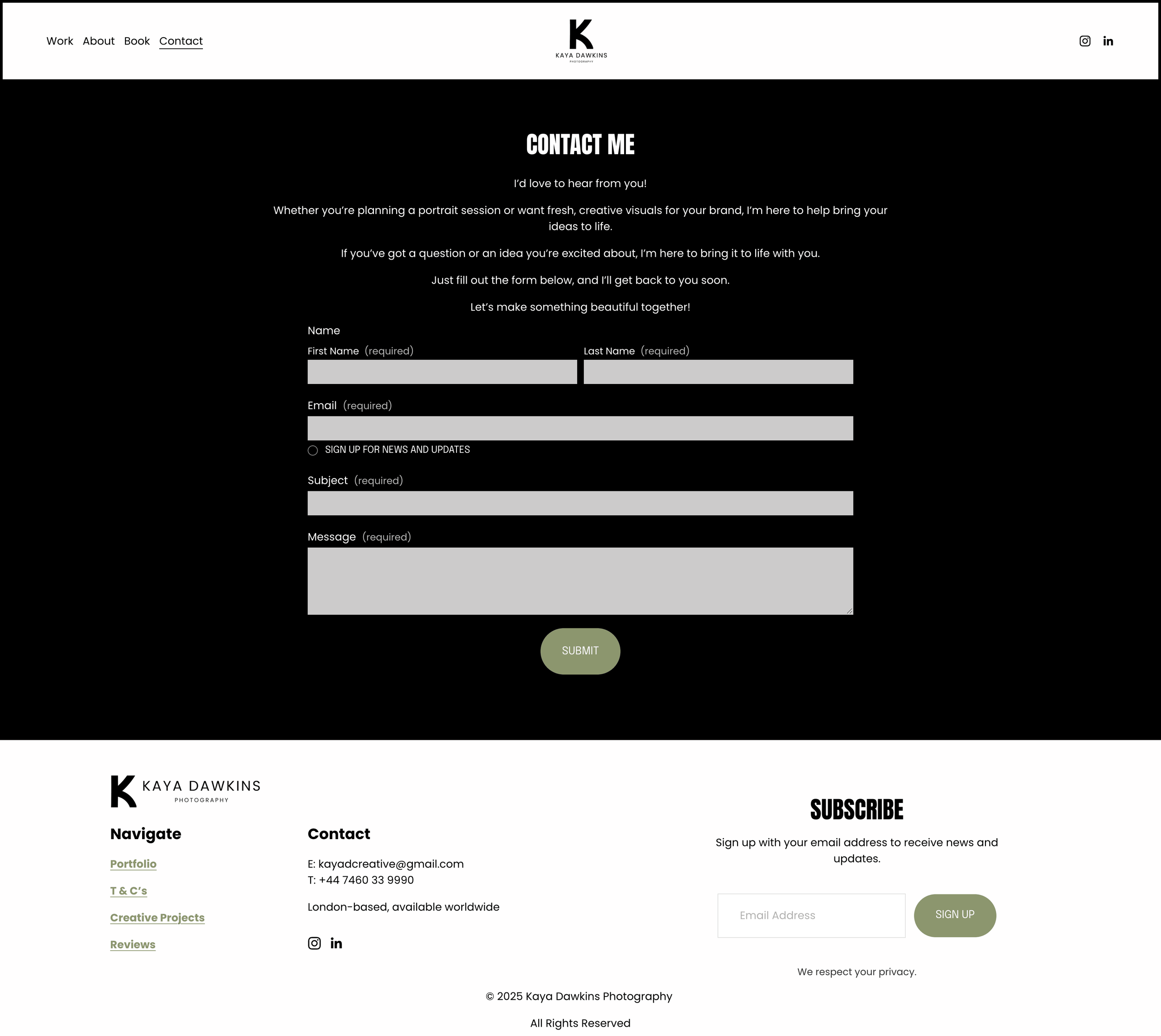
“As my brand is growing, I knew I needed something which spoke directly to my audience. I needed to create a clear system where my clients can easily see my work, my prices and understand more about me, my style and why I would be the best photographer for them.”
– Kaya Dawkins

Copywriting
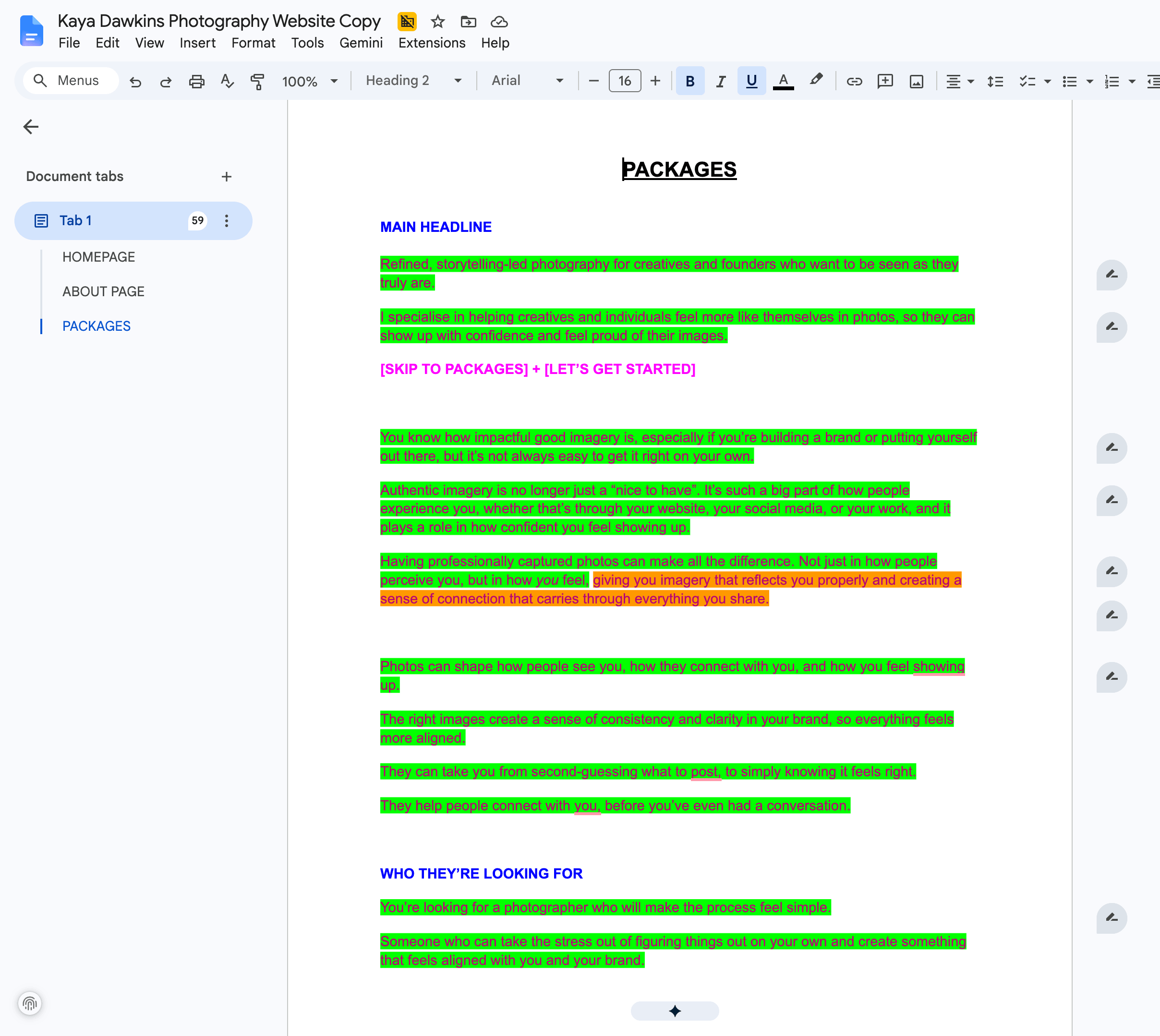
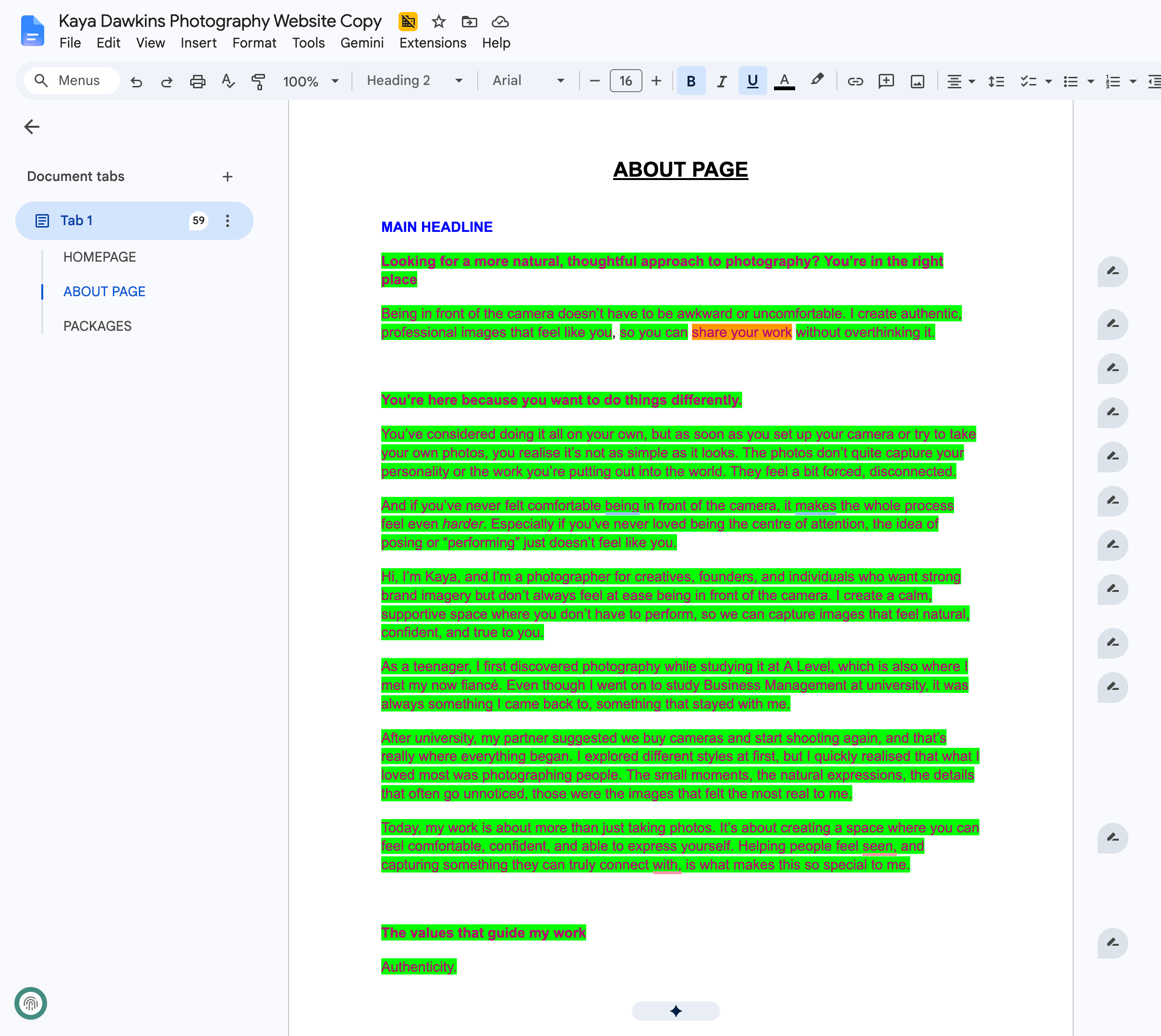
I wrote full copy for her Home, About, and Services pages, moving well beyond the bare-minimum text she had before. The copy was designed to speak directly to her ideal clients (the creatives who have been putting off getting proper headshots, the founder who knows their iPhone selfies aren't cutting it anymore) and walk them through the experience Kaya offers, not just the deliverables.
Every section was built around a simple principle: show people what it feels like to work with Kaya, and the bookings will follow.
The copy was written in first person to match Kaya's approachable, personal brand. I focused on experience-led messaging — less "here's what you get" and more "here's how you'll feel."
The Process
I approached this project knowing that Kaya's brand needed two things: a stronger voice and a clearer visual identity that carried consistently from her website to her social media.
Brand Strategy & Voice
We started by defining what makes Kaya's brand genuinely different – that relaxed, supportive energy she brings to every shoot. The fact that she works with people who are often stepping into a more visible version of themselves, whether they're launching a business, building a personal brand, or simply want to feel confident on camera for the first time. There's a quiet transformation happening in her work, and that needed to come through in every word on the site.
I developed a brand voice that's friendly, encouraging, and grounded – warm without being overly casual, and professional without feeling corporate.
web design
The site was built as a custom Squarespace design – clean, modern, and minimal with an elegant edge. I designed it to be portfolio-led, because Kaya's images deserve to take centre stage, but supported by intentional copy and clear calls to action throughout. I integrated Google reviews for social proof, built out a proper booking flow, added a contact form, a newsletter sign-up for the educational content she's planning, and structured the site so visitors always know exactly what to do next.
All these form an intuitive path from browsing to booking.
Design Decisions
Colour Palette
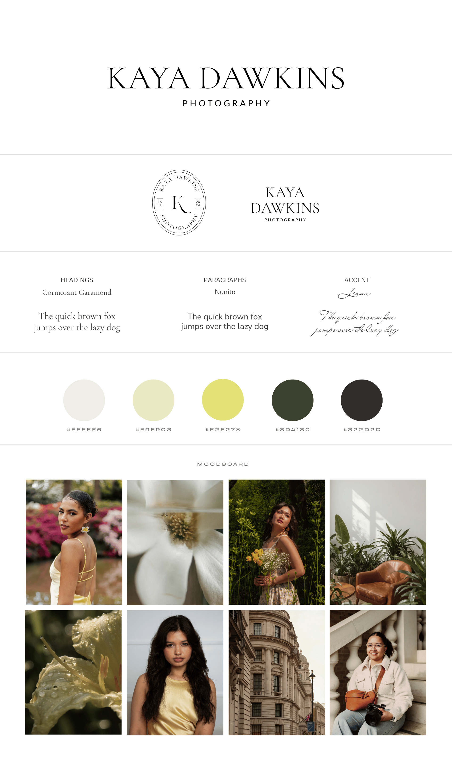
Kaya was drawn to greens and yellows, which linked beautifully to her outdoor, natural-light photography style, so I created a warm but earthy colour palette to mirror that.
The dark green represents calm and comfort, which is what differentiates Kaya’s work from other photographers’; it is very important to her that her clients feel at ease during sessions. The yellow pastels reflect Kaya’s warm and friendly personality.
The two colours combined create a sense of vintage elegance that stands out from many creatives’ websites, which are often just black and white, once again making Kaya stand out from the crowd.
The colour combination is also a reflection of Kaya’s photography, which is often captured outside, in green spaces, typically with flowers (especially yellow ones).

Typography
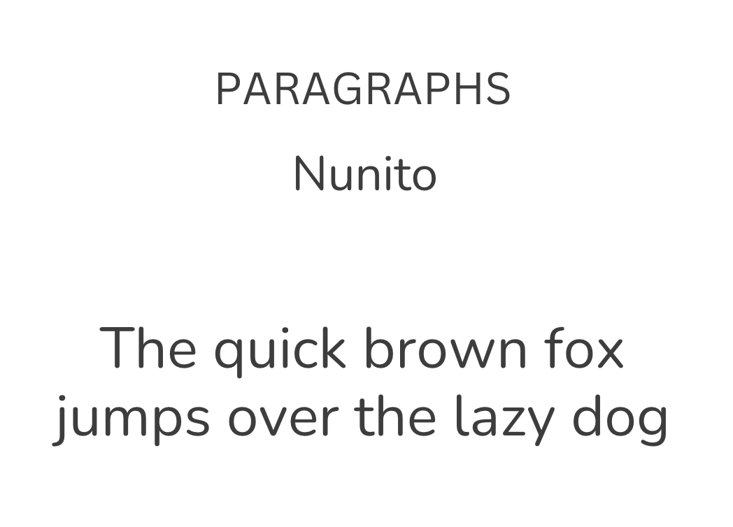
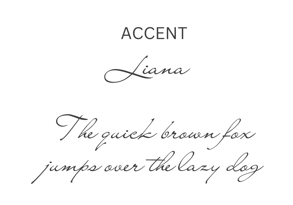
Kaya had been using Anton and Poppins, and while Poppins is a solid workhorse, the overall pairing needed refinement. We explored options that balanced her desire for a clean, modern feel with the quiet elegance her brand calls for – keeping readability high and personality front and centre. The final pairing gives the site structure and warmth in equal measure.
Photography Direction
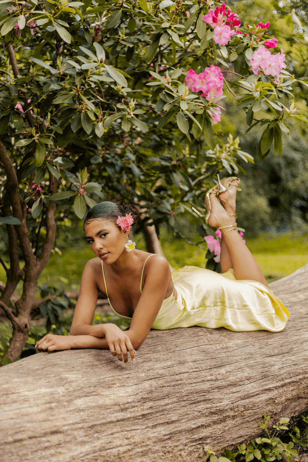
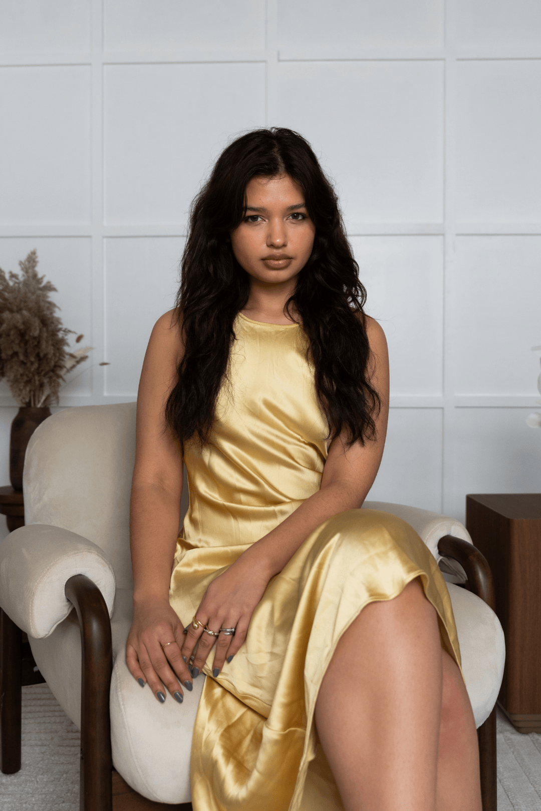
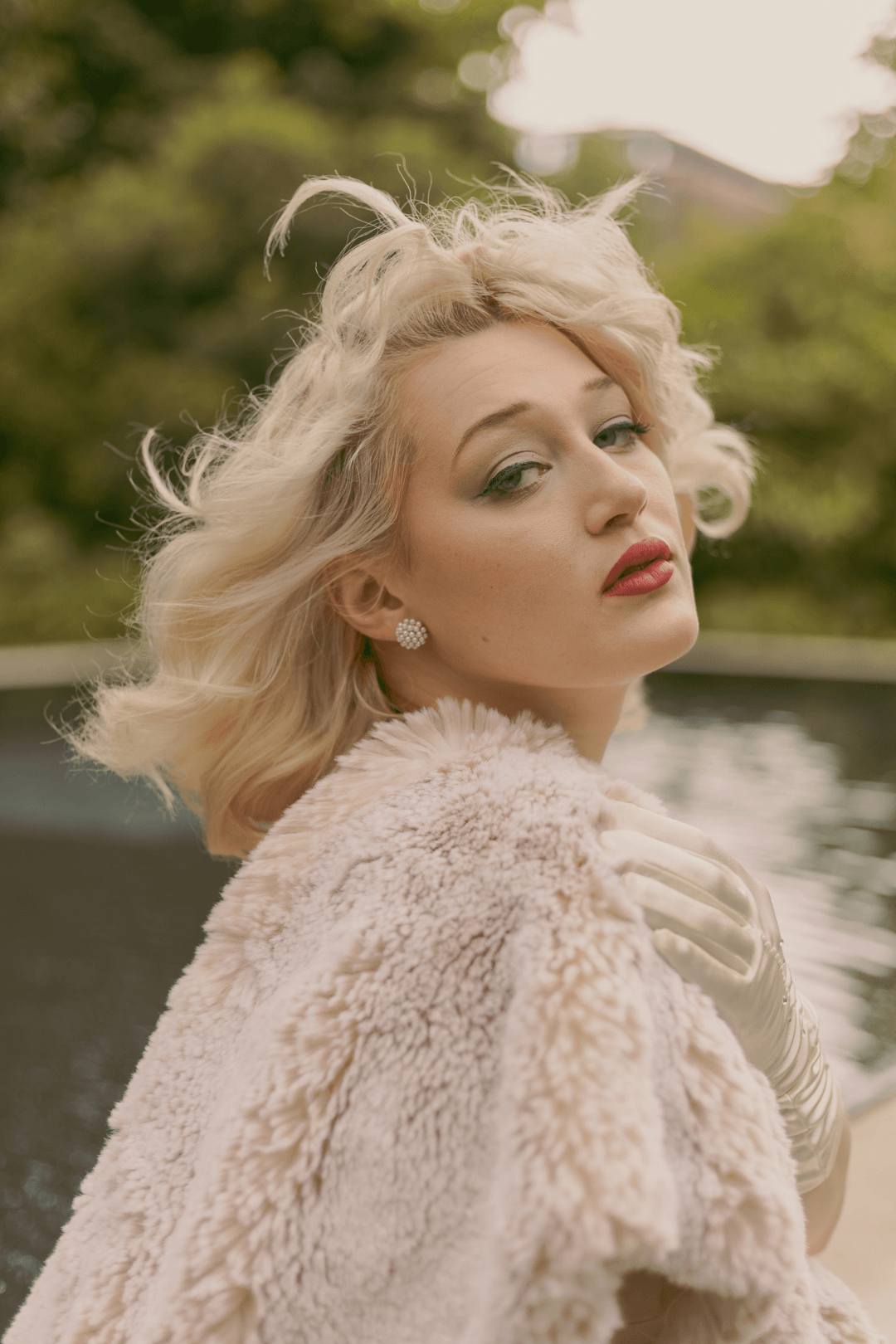
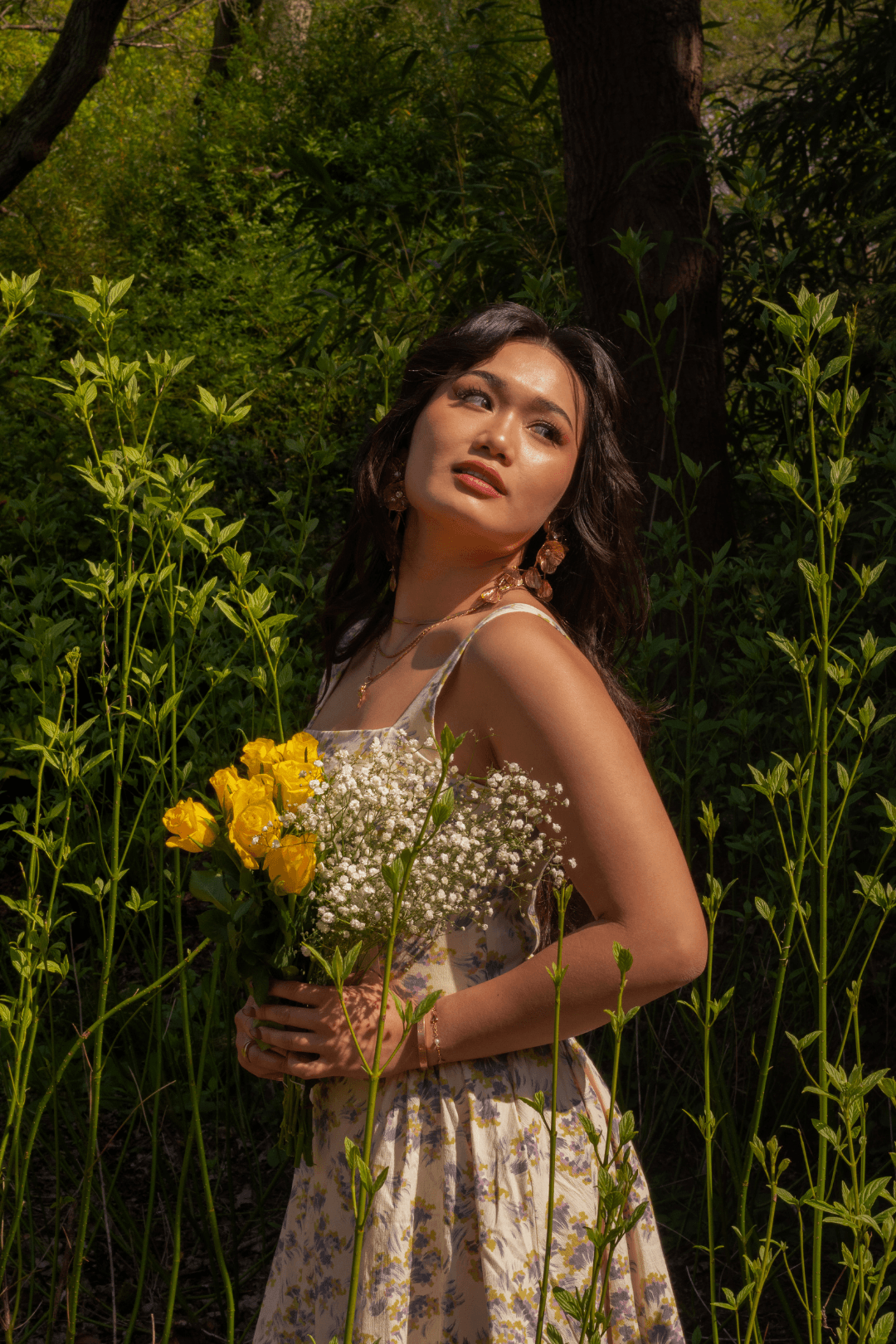
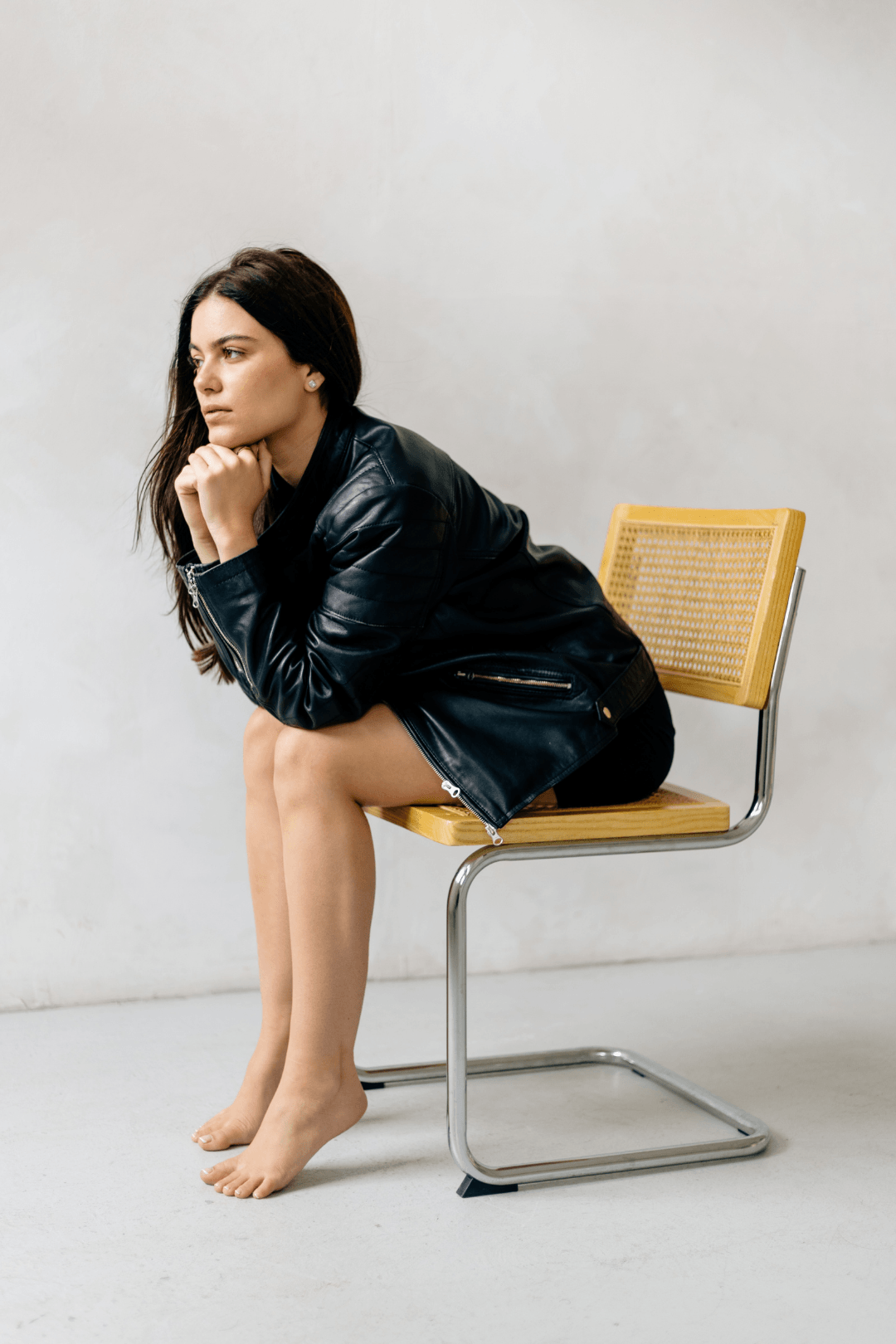
This was the easiest part. Kaya’s own imagery did all the heavy lifting. We curated and placed her portfolio images strategically across the site so they do what they do best: make people feel something. Hero images were chosen for impact, gallery layouts were designed to let the work breathe, and every image placement was intentional.

Logos & Brand Mark
The primary logo: Kaya's new primary logo is a clean, elegant wordmark that lets her name speak for itself. Set in a classic serif typeface, it's sophisticated and timeless — the kind of logo that feels as refined as her photography. The simplicity is intentional: there's no need for embellishment when your brand voice is this clear. This wordmark works beautifully across her website, social media headers, and printed materials, giving her a consistent, professional presence everywhere she appears.
The submark: the oval brand mark was designed as a flexible mark that works independently from her wordmark. Centred around the letter "K," it's clean, minimal, and instantly recognisable. The elegant oval frame and serif "K" give it a classic, authoritative feel — perfect for use as a seal on email signatures, a favicon, or a watermark on her portfolio images. It's the kind of mark that builds recognition and feels intentional every time it appears.
Why these work together: the combination of the full wordmark and the compact oval mark gives Kaya flexibility without sacrificing consistency. She can use the wordmark when she needs to introduce herself fully, and the mark when she wants to show up with elegant simplicity. Both reflect the same values: refined, intentional, unapologetically professional.
The “After”
Kaya went from a website that was essentially a gallery with a logo to a fully realised brand presence that communicates exactly who she is, who she's for, and why she's the right choice.
The new site positions her as a professional, approachable photographer with a clear point of difference, and it does it from the very first scroll. Visitors now land on a homepage that immediately communicates her style, introduces her services, and makes it effortlessly easy to take the next step. The About page tells her story in a way that builds genuine connection, and the Services page clearly outlines what's on offer without overwhelming anyone.
She now has a website that works as hard as she does and feels exactly as calm and confident as one of her shoots.



Client Testimonial
-
![]()
Working with Elisa was amazing!
I enjoyed the whole process and experience. Every step was professional, with clear communication throughout the whole process. I loved the initial calls and going into detail about what I want for my website which included the brand, colours, tone of voice and how I wanted to brand to feel like. The questionnaire at the start helped a lot with communicating and understanding how to target the pain points of my clients and how I help them through my work. The final result translated everything we discussed into the most beautiful website.
– Kaya Dawkins, Brand & Portrait Photographer
The Transformation
A brand that finally feels cohesive
Kaya went from a fragmented visual identity to a brand with a clear, consistent look and feel — one that holds together across every touchpoint.
A website as unique as her work
No templates, no generic layouts. Kaya's website reflects who she actually is — distinctive enough that visitors immediately understand they're in the right place.
Messaging that speaks directly to her clients
The strategy work at the start meant Kaya's website now speaks directly to her audience's pain points — not just describing what she does, but communicating why it matters to them.
Copy that captures her voice perfectly
The copywriting translated everything Kaya wanted to say — her tone, her values, her offer — into words that felt entirely her own.
Want a website like this one?
If your website isn't doing your work justice, if you know your brand is better than what's currently showing up online, I'd love to chat.
I design strategic Squarespace websites and write conversion-focused copy for business owners who are ready to show up with intention.

